For many reasons, Photoshop has become the industry standard for website design and prototyping. Since Adobe has phased out Fireworks, their application for website design, that pretty much settles what will be used going forward.
When you deliver a design to your web developer, there are certain methods and tools, discussed below, that when used correctly can help to ensure that you will get back exactly what you were expecting. As a bonus, it will also take less time for the developer to execute and thus, should cost less.
The first two tips: Organize and Design on a Grid are methods that should be used for every website design. The next two, Use Smart Objects and Use Artboards, are relatively new tools that are really useful and will take your Photoshop work to the next level and can save you a bit of time as well.
Organize
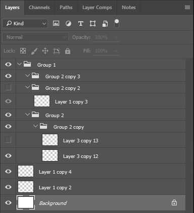
If your Layers panel looks like the screenshot above, you’re working too hard (and your developer is too). Photoshop provides a number of ways to organize your design: Layer Naming, Layer Groups, Artboards, Smart Objects and Layer Comps. Using these features makes it easier to respond quickly to client change requests, and your developer will thank you for not making them dig through a pile of “Layer 5 copy 17” layers to figure out how the design pieces together. A few quick tips here:
- Delete any unused layers
- Group related layers into Layer Groups
- Give layers and layer groups descriptive names
Design on a Grid
Designing on a grid adds balance and consistency to a web design. In addition to the many visual and user experience benefits, a grid based design gives your developer added opportunity to modularize and reuse code. In addition to a more robust, flexible and maintainable final build, it will take less time to code and will save time and money.
Photoshop CC’s Guide Layout feature allows you to set up a grid system in seconds. Adobe has a blog article on the topic with a few examples of what’s possible. We recommend any of these popular grid systems out there today:
- 960 Grid System – http://960.gs/
- 1200px Grid System – http://1200px.com/
- Bootstrap Grid – http://getbootstrap.com/css/#grid
- Foundation Grid – http://foundation.zurb.com/grid.html
Use Smart Objects
Although Smart Objects have been around since Photoshop CS2, they remain an indispensable, yet underused, tool for web designers. Smart Objects allow you to include another file, either raster or vector, into your document. Once included, that object can be transformed, modified with filters, etc. without changing the original file.
A a basic example, imagine you’ve designed a team listing page for a client without using Smart Objects. Maybe each row in that design looks like this:
Great. Now the client asks to have the photos scaled down some huge percentage. You gently recommend against it, but they insist. Here’s the result:
The client sees this and instantly changes their mind. They ask to scale the photos back up to the original size. You happily comply, with this result:
As you can see the, scaling the photo down caused the image to lose its original resolution. Scaling it back up produces a muddy looking image. If this had instead been inserted as a smart object, the image would appear as crisp as it did before any transformations were applied.
Perhaps an even more convincing use case for smart objects is using them to group together entire segments of a layout. Layer groups, for example, can be converted into a smart object and reused throughout a design; even across artboards. This is great for groups of elements (like a header or footer) that appear consistently across multiple layouts in your document. If the client want to change the color of the header, simply open the header smart object, make the change, and all copies of that smart object will update to reflect that change.
Adobe’s help page on smart objects is a good read and also goes into more detail on embedded vs. linked smart objects: https://helpx.adobe.com/photoshop/using/create-smart-objects.html
Use Artboards
Artboards are new to Photoshop CC and are simply another tool for organizing your design. They allow you to have multiple canvases in a single document.
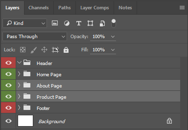
Like most things in Photoshop, there’s usually 10 different ways to achieve the same goal. Currently, you may be managing multiple page layouts in a single document by grouping layouts into layer folders, like this:
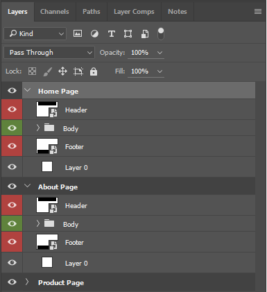
Although a proven approach, others in your team and your developer will need to figure out exactly how to navigate the PSD. Layer Comps can ease that confusion, but Artboards are better still. Here’s the same series of layouts organized into Artboards:
Much better. Now there’s no need to hide or show certain layers or ensure your layer comps are updated. Each layout has it’s own artboard and each shares the header and footer using Smart Objects.


