As phones, tablets and monitors continue to achieve higher and higher screen resolutions, the need for the ability to display high resolution images and graphics on the web is only going to increase. This article will help to convey some of the basic concepts around HiDPI and how web designers and builders can accommodate new devices that employ it.
What is HiDPI?
DPI is the acronym for “dots per inch” and thus, HiDPI denotes high dots per inch. In short, more pixels into a given area. It is used interchangeably with Apple’s marketing term, “Retina Display.”
For computer monitors, tablet and phones, PPI (pixels per inch), a measure of pixel density for a display device is probably a more accurate term, and the terms are generally used interchangeably although DPI refers more specifically to print. So, it really should be labeled HiPPI, and some have started to use that term
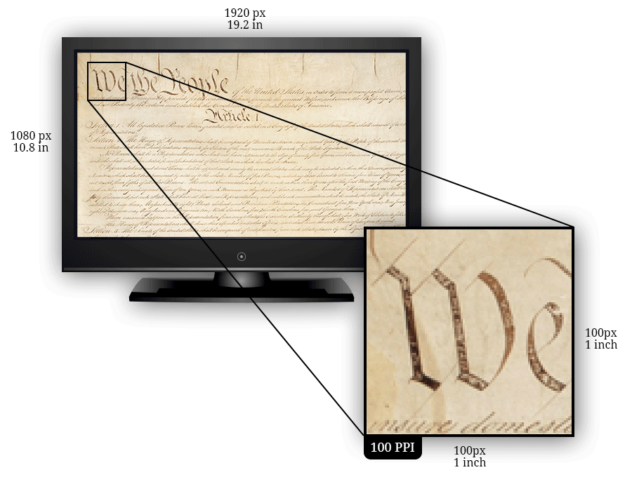
PPI is the physical number of pixels that a screen contains in a given inch. For example, imagine a ‘standard’ 19.2 inch by 10.8 inch LCD screen with a native resolution of 1920px by 1080px. The PPI of this screen would be 100 PPI.
Why HiDPI Matters on the Web
Before we can talk about HiDPI, or “Retina” as it’s branded in the Apple world, we first need to take a quick look at the steady increase in resolution of mobile and desktop screens, starting in 2007:
2007
| Device | Resolution (ppi) |
|---|---|
| iPhone (1st gen) | 320 x 480 (163 ppi) |
| HTC TyTN II | 240 x 320 (143 ppi) |
| BlackBerry Curve 8330 | 320 x 240 (160 ppi) |
| Nokia E61i | 320 x 240 (142 ppi) |
Although this list is anything but comprehensive, it gives us a rough snapshot of where mobile displays were in 2007; an average of 152 ppi.
2011
| Device | Resolution (ppi) |
|---|---|
| iPhone 4s | 640 x 960 (330 ppi) |
| Samsung I9100 Galaxy S II | 480 x 800 (217 ppi) |
| Motorola DROID RAZR XT912 | 540 x 960 (256 ppi) |
| Samsung Galaxy Nexus I9250 | 720 x 1280 (316 ppi) |
Although only 4 years later, our average has jumped to 280 ppi.
A final fast forward to 2015 and we see the Samsung Galaxy S6 (577 ppi), LG G4 (538 ppi), and the Sony Xperia Z4v (565 ppi). An average of 560 ppi.
What Ever Increasing PPI Means for the Web
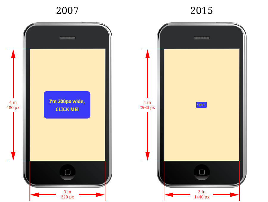
Okay, so PPI is going up… now what? Consider a hypothetical mobile phone screen with the exact same physical dimensions of 3 inches by 4 inches. One phone is from 2007 with a resolution of 320 x 480 pixels (like the iPhone 1st gen), the other from 2015 with a resolution of 1440 x 2560 pixels (like the Samsung Galaxy S6).
If you were to place a snazzy blue 200 pixel wide button on your website, here’s how that same button might appear on each phone:
A Pixel is Not Always a Pixel
As resolutions began to climb, it became clear that pixel dimensions could no longer be mapped at 1:1 scale in the browser. This led to the introduction of the “reference pixel” and the “device pixel ratio” (aka “CSS pixel ratio” or “dppx”), which is the ratio of physical pixels to logical pixels for a given screen.
The W3C defines a reference pixel in some detail. The summary for our purposes being that a pixel in our CSS may not map directly to a single physical hardware pixel when it gets displayed on the user’s screen.
If our phone from 2015 above had a device-pixel-ratio of about 4 (for the sake of example), the rendered results on both phones would be almost identical. This is because every 4 physical pixels on the 2015 phone would translate to a single “CSS pixel”.
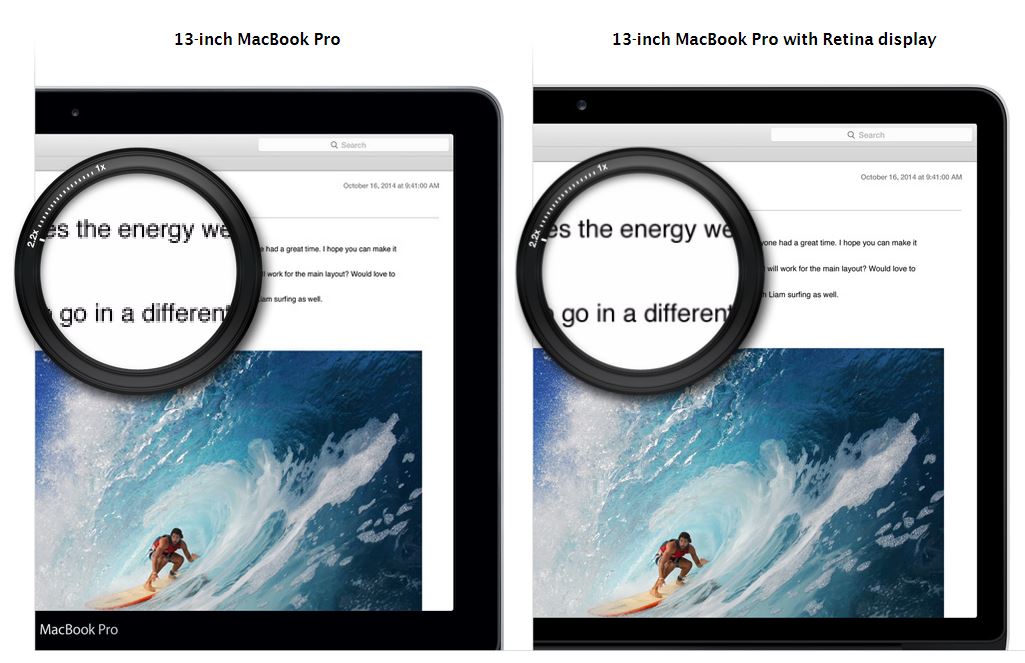
There is a good illustration of this capability: Apple has a tool on their site where you can compare a 13-inch MacBook Pro to a 13-inch MacBook Pro with Retina display.
Images
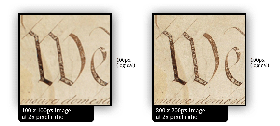
The introduction of device pixel ratios and rapid adoption by web browser developers gives web designers more control of how their web site will display on devices with varying pixel densities. However, it highlights an issue when dealing with raster graphics (JPEG, GIF, PNG, etc.)
Although you might reason that an image would look similar on a low versus high density display, the results are anything but as this simulation hopefully illustrates:
Solutions
The list of solutions to this issue is growing, thankfully. Some potentials include:
Don’t Use Images
Where possible in your design, use vector graphics (SVG) and font icons (like Font Awesome or create your own with Fontello)
Pros:
- Typically smaller file size than a comparable raster image
- Excellent basic browser support
Cons:
- A few strange edge cases (mostly in IE)
Single HiDPI Image
Serve a single (optimized) HiDPI JPEG / PNG / GIF image to all users.
Pros:
- Simple to implement and manage
- Supported everywhere
Cons:
- 1x devices will download a 2x sized image
Multiple Resolution Versions of an Image
By detecting the device’s pixel ratio via a CSS media query, Javascript or server-side (avoid!) it’s possible to use that information to serve images at the appropriate resolution for that device.
There are limitations depending on the approach. For example, CSS media queries only allow adjustments when an image is used as a background. Javascript can introduce delays in the images being loaded.
The Future
The HTML and CSS specifications are being expanded with functionality that directly targets these HiDPI issues:
image-set() and srcset
Both image-set() and srcset allow web developers to specify multiple versions of an image through either CSS (image-set) and HTML (srcset) and have the browser determine which resolution image is appropriate.
Native browser support is coming along for both, and browsers without support fallback to the standard definition image. Polyfills also exist (like Picturefill) to bring most modern browsers up to to speed if they don’t support srcset natively.
Summary
Based on current trends, dealing with high pixel densities on the web is not going away. More and more desktop and laptop displays with high densities are emerging making it less of a mobile specific issue and more of an everywhere issue.
There’s no one obvious sure fire solution yet when it comes to presenting images cleanly and efficiently for all users. However, there are plenty of good, and getting better, options to choose from depending on the application and audience.

